 Atomize
Free
Atomize
Free
Atomize is an open source AI programming design system and React component library for designers and developers. Based on the atomic design (Atomic Design) methodology, it provides end-to-end mapping capabilities from Sketch/Figma design drafts to React code.
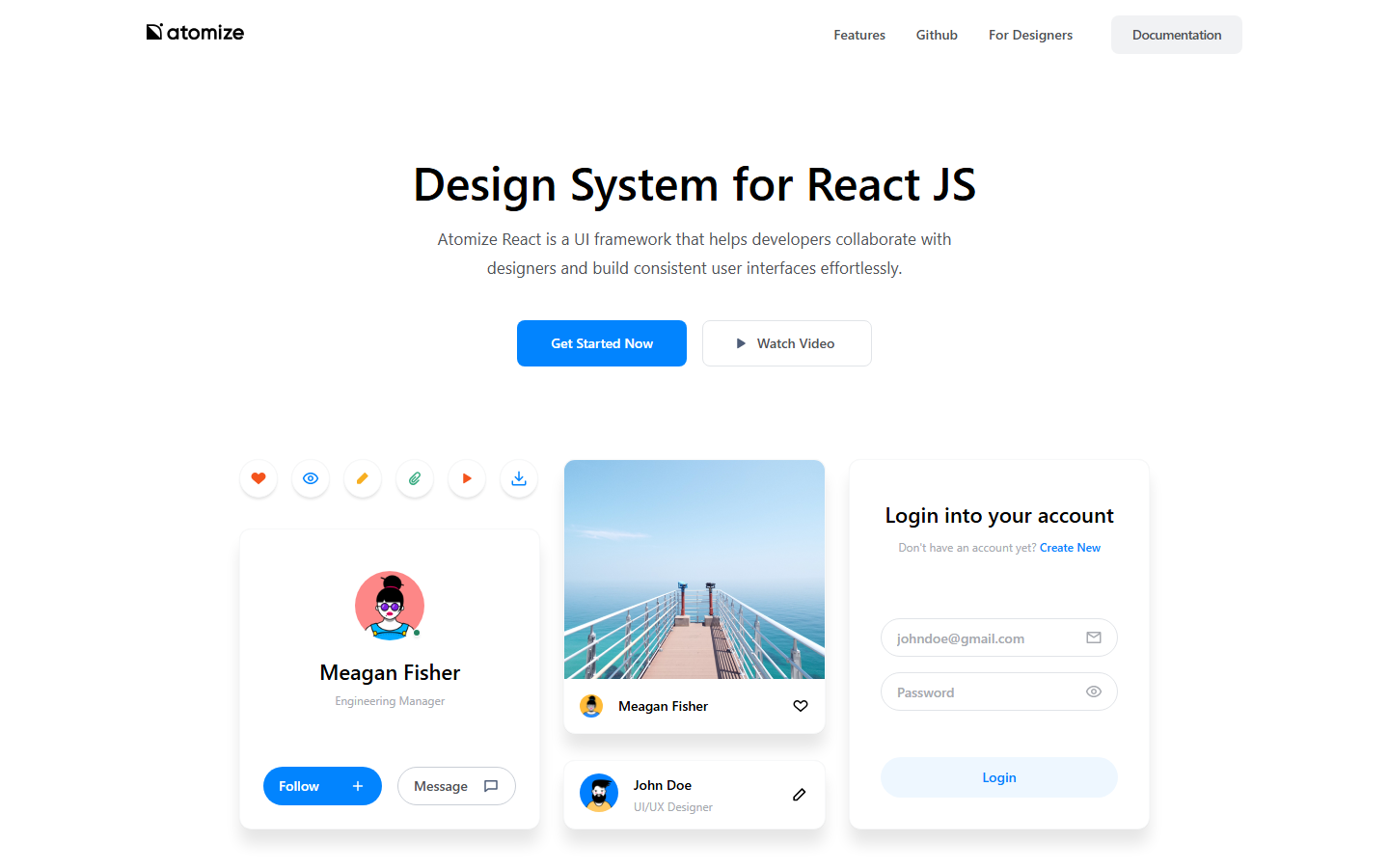
Atomize
Core parameters and statistics
Atomize is an open source React UI design system based on the Atomic Design methodology, independently developed and maintained by Proksh Luthra. It is not an AI model or API service, but a complete set of front-end development framework and design resources - including React component library (Atomize React), Sketch design resource files (Atomize Design), theme system and responsive grid tools. Its core value is to eliminate the "design-code mapping gap" between designers and developers through a shared, semantic design language.
| Projects | Public Information |
|---|---|
| Official positioning | Design System for React JS — helps developers and designers collaborate to build consistent user interfaces |
| Technology stack | React + styled-components + Atomic Design methodology |
| Component count | 15+ out-of-the-box components (Atoms + Molecules) |
| Predefined colors | 60+ semantic color variables |
| Design resources | Sketch design source files (distributed by Gumroad) |
| Open Source License | MIT |
| GitHub Stars | ~1,800 stars (main repository) |
| npm weekly downloads | ~19 (npm official data) |
| Latest version | 1.0.28 (npm) |
| Supported platforms | Web, Electron, SSR (server-side rendering) |
Design-Code Synchronization Mechanism: The core idea of Atomize is not "AI automatically generates code", but to establish a two-way mapping between design Token and React component attributes through the atomic design methodology. When designers use Atomize to design resources in Sketch, the selected parameters such as color, spacing, font size, etc. directly correspond to textColor, p (padding), textSize and other Props in the React component. Developers do not need to guess the design intention.
Ecological Density: 1,800+ Stars and 336 Forks on GitHub indicate that it already has a certain community foundation in independent open source design system projects, but its weekly npm downloads (approximately 19) also reflect that it is not a mainstream choice and prefers a niche high-quality design system.
Maturity Judgment: The last submission of the project was about 3 years ago, and the latest version of npm was released about 5 years ago, indicating that the project has entered stable maintenance rather than active iteration stage. This is both a good thing (the API is stable), but it also means that it lacks the "continuous evolution" attribute of AI design to code tools.
User and market recognition
Atomize's market recognition mainly comes from word-of-mouth spread in the open source community and the technical influence of independent developers, rather than large-scale commercial revenue or enterprise customer numbers.
Community Popularity: The main GitHub repository (github.com/Proksh/atomize) shows about 1,800 Stars and 336 Forks at the current point in time, with 9 contributors. For an open source design system maintained by independent developers, this number reflects stable attention, but there is a huge gap compared with mainstream solutions such as Material-UI (~94k Stars) and Ant Design (~93k Stars). Its weekly downloads on npm are only about 19 times, indicating that the direct adoption rate in production is very low, and it is more used as a learning reference or small personal project.
Design resource distribution: Atomize Design (Sketch resource package) is distributed through Gumroad, providing a paid resource entrance for designers, but the specific sales data are not disclosed.
Industry benchmarking positioning: Atomize's ecological niche is "lightweight React design system". Different from the design systems driven by major manufacturers such as Ant Design (enterprise-level middle and backend), Material-UI (Google Material Design specification), Chakra UI (high accessibility), Atomize's advantages lie in concise API design, clear layering of "atoms-molecules", and a highly customizable theme system. Its disadvantages are equally obvious: small number of components, weak community ecology, and high uncertainty in long-term maintenance.
Prerequisites: For the team, choosing Atomize instead of more mainstream solutions usually means that you agree with its atomic design concept, are willing to spend time building a custom theme, and the project does not have high requirements for component diversity.
Cost advantage
Atomize’s cost structure is extremely simple – completely free and open source, with no hidden fee paths.
| Fee Type | Atomize | Material-UI (MUI) | Ant Design |
|---|---|---|---|
| Open Source License | MIT Free | MIT Free | MIT Free |
| Premium themes/templates | No charges | MUI Store paid templates | Ant Design Pro paid |
| Design resources (Sketch/Figma) | Atomize Design is available through Gumroad for a fee (price not disclosed) | Partially free + Figma community plug-in | Open source free + Figma community resources |
| Enterprise Support | None | MUI X paid components (data tables, date pickers, etc.) | No official paid tier |
| Commercial License Restrictions | None (MIT) | None (MIT) | None (MIT) |
Free and open source: Atomize is licensed under the MIT license and can be used freely for personal, commercial, and internal corporate projects without restrictions on seats, usage, or functions. This is its core cost advantage compared to commercial design-to-code tools (such as Anima and Locofy) - you will never be locked in by "number of exports", "team seats" or "advanced components".
Hidden Cost of Design Resources: Atomize Design (Sketch Resource Pack) is sold through Gumroad, prices are set by author Proksh Luthra, there may be a one-time purchase cost. But this is not mandatory consumption - developers can develop using only the React component library, and designers can also establish the mapping relationship between design specifications and components by themselves.
True Cost Structure: For production-level projects, the true cost of adopting Atomize is not in software licensing, but in:
- Learning Curve: The team needs to understand the naming system and theme configuration method of atomic design;
- Component expansion: 15+ components are often not enough for mid- and back-end businesses, and upper-level business components need to be encapsulated by themselves;
- Long-term maintenance: Since the project has entered a low-activity state, future React version upgrades may cause compatibility issues, and the team needs to fork and maintain it themselves or bear the migration cost.
Main functions
Atomize's capabilities revolve around the link "atomic design → reusable components → consistent user interface". The public capabilities can be summarized into five levels:
- Atoms: The most basic reusable UI elements, including Button, Text, Icon, Input, Image, Div, etc. Each atomic component exposes semantic Props (such as
textSize,textColor,bg,p,m), allowing developers to directly express design intentions through property combinations without having to write inline styles or CSS class names. - Molecules: Composite components composed of multiple atoms, such as Card, Modal, Navbar, PaymentCard, etc. Molecular components preset common layout combinations while retaining the ability to override atomic-level attributes.
- Theme System: A global Theme Provider centrally manages design tokens such as color, spacing, fonts, shadows, breakpoints, etc. Modifying theme variables can globally refresh the appearance of all components without the need to adjust file by file. Preset 60+ semantic color variables, covering main colors, functional colors, gray scales and status colors.
- Responsive Grid: A grid system based on a configurable number of columns, supporting decimal column width, breakpoint interval control and nested layout. Adaptive switching from mobile to desktop can be achieved with just a few lines of configuration.
- Sketch design resource files: Provide designers with Sketch source files that exactly match React component properties, including layout specifications, color styles, text styles, and component templates. The visual parameters of the design draft produced by using this resource on the design side can directly correspond to the Props input of the React component.
Synergy: The real value of Atomize does not lie in a single function, but in the complete mapping chain of "color/spacing/font variables of design resources → theme Token → component Props". The designer defines a button style in Sketch, and its color value is automatically associated with the default values of bg, textColor, hover and other Props of the Button component through Atomize's naming system. Developers do not need to manually consult the design specification document to translate the visual parameters.
Model and version evolution
Atomize is not an AI model, so there are no "model versions". However, the software version has a clear context and can be divided into three stages:
Early exploration stage (~2019)
The project was launched as a prototype on GitHub and completed the initial architecture of the core component library, including basic atomic components, theme providers and development context construction. At this stage, the style scheme based on styled-components and the hierarchical structure of Atomic Design have been laid down.
Official release stage (~2020-01, v1.0.0)
The first semantic version is released, the number of components is expanded to 15+, and a complete theme system, responsive grid, icon system and documentation site are introduced. Sketch design resources are simultaneously available on Gumroad for designers to use.
Stable maintenance phase (~2021-07, v1.0.28)
Last released on npm, the project has since entered a low active maintenance state. The last merge PR on GitHub (#87, relying on security updates) was about 3 years ago. During this period, the React ecosystem has experienced the comprehensive popularity of functional components and Hooks, the introduction of Concurrent Mode, and the rise of Server Components. However, Atomize has not carried out architectural-level updates in response to these changes.
| Version | Date (approximately) | Highlights of changes |
|---|---|---|
| 0.x (Beta) | ~2019 | Prototype verification, core atomic components and styled-components architecture |
| 1.0.0 | ~2020-01 | Officially released, 15+ components, theme system, grid, icon system |
| 1.0.28 | ~2021-07 | Latest npm release, dependent on security fixes, feature frozen |
Version Recommendation: For teams planning to adopt Atomize, it is recommended to lock in version 1.0.28 and use an exact version number instead of a range in package.json ("atomize": "1.0.28" instead of "atomize": "^1.0.28") to prevent untested dependency updates from introducing breaking changes.
Technical advantages
Atomize's technical route is different from large design systems such as Ant Design and Material-UI. Its advantages come from the combined design of "lightweight + semantic Props + atomic layering".
Zero runtime style scheme based on styled-components: Atomize uses styled-components as the underlying style scheme, and the styles of each component are injected at runtime through CSS-in-JS. The advantage of this solution is that the style and component logic coexist in the same file, there is no class name conflict, and it supports dynamic Props-driven style calculation. The disadvantage is that the runtime overhead (especially in large list rendering scenarios) and the packaging size are larger than the CSS Modules solution. For small to medium-sized projects, this trade-off is usually worth it.
Semantic Props design: Atomize components do not accept CSS property names, but expose domain semantic Props. For example, bg="warning300" is closer to the designer's language than backgroundColor="#FEF3C7", and the global token is automatically followed when the theme is switched. This approach greatly reduces the communication cost in the design review stage - the designer can directly say "use warning300 for the background of this button", and the developer does not need to read the design specifications to check the color value.
Atomic layered composability: Atomize follows Atomic Design's "atom → molecule → organism" layering. This means that developers can assemble from the smallest granular atomic components, rather than being forced to use highly encapsulated, non-detachable "full-featured" components. When the business needs a special combination of Button and Input, atomic layering makes the cost of creating new molecular components much lower than searching for "whether there is a corresponding API parameter" in a large component system.
The limitations are also obvious:
- No AI capabilities: Atomize is not an AI tool and does not include any LLM inference, automatic code generation or Figma plug-in capabilities. The mapping of design drafts to code relies on designers and developers to manually follow the specifications, rather than automatic conversion by AI.
- Insufficient component ecology: 15+ components only cover the most basic UI elements, and there are no mid- and background high-frequency components such as date selection, data tables, and tree controls.
- Long-term maintenance risk: Projects maintained by independent developers may completely stagnate when encountering the author's energy transfer, career changes, etc.
How to use
Atomize's access method is direct and standardized, suitable for teams with existing React projects.
| How to use | Installation command | Applicable people | Features |
|---|---|---|---|
| npm package installation | npm install atomize react-transition-group |
React developers | Integrate directly through package managers |
| Customized build of source code | git clone + npm install + npm start |
Senior developer | Can modify source code, local development and debugging |
| Sketch design resources | Gumroad purchase and download | UI/UX designers | Design source files mapped to React component properties |
Quick Start Steps
Step 1: Install and configure Theme Provider
npm install atomize react-transition-groupimport { Provider as StyletronProvider } from "styletron-react";
import { Client as Styletron } from "styletron-engine-atomic";
import { ThemeProvider } from "atomize";
const engine = new Styletron();
function App() {
return (
<StyletronProvider value={engine}>
<ThemeProvider theme={{}}>
<YourApp />
</ThemeProvider>
</StyletronProvider>
);
}Step 2: Use components
import { Div, Text, Button, Icon } from "atomize";

function PaymentCard() {
  return (
    <Div bg="white" shadow="2" rounded="xl" p="1.5rem">
      <Text textSize="title" textWeight="500">$1,410.16</Text>
      <Text textSize="caption" textColor="light">per month</Text>
      <Button bg="info700" hoverBg="info900" m={{ t: "1rem" }}>
        Upgrade Now
      </Button>
    </Div>
  );
}
Step 3: Customize the theme
const myTheme = {
  colors: {
    primary: "#FFC148",
    primary700: "#E5A830",
    info700: "#2754E6",
    warning300: "#FEF3C7",
    gray300: "#D1D5DB",
    light: "#6B7280",
  },
  fonts: {
    primary: "'Inter', sans-serif",
  },
  breakpoints: {
    sm: "576px",
    md: "768px",
    lg: "992px",
    xl: "1200px",
  },
};
Usage suggestions
- New projects first: Atomize is more suitable for new projects starting from scratch rather than migrating existing established design systems.
- With a custom theme: Do not use the default theme directly. It is recommended to define complete
colors,fonts,breakpointsand other tokens based on brand colors at the beginning of the project, otherwise the subsequent global replacement cost will be very high. - Note react-transition-group dependency: Atomize's animation capabilities depend on
react-transition-group, which needs to be introduced together during installation.
Product Pricing
Atomize's product pricing structure is extremely simple because its core asset (the React component library) is completely free and open source.
| Charges | Price | Description |
|---|---|---|
| Atomize React (npm) | Free (MIT open source) | No function restrictions, no seats, no export limit |
| Atomize Design (Sketch) | Paid (Gumroad channel) | One-time purchase, the specific price is subject to the author's Gumroad page |
| Commercial License | No additional license required | MIT license automatically covers personal, commercial, and enterprise use |
| Technical support | No official paid support | Only maintained through GitHub Issues community |
| Deep customization | No official service | The team needs to fork or develop secondary development by itself |
The economic nature of free: The logic behind Atomize choosing MIT open source is that it is not a commercial product, but a work of independent developers establishing technical influence. The author, Proksh Luthra, obtains career opportunities through the project's personal brand (GitHub homepage, Behance, Dribbble) rather than directly making money through software licensing. This means users are the beneficiaries, but it also means no service commitments and no SLAs.
Comparison with commercial design conversion tools:
| Compare Dimensions | Atomize | Anima (Figma to React) | Locofy AI |
|---|---|---|---|
| Price | Free (MIT) | Free Trial + Paid Pro | Free Trial + Paid Team |
| AI automatic conversion | Not supported | Supports Figma plug-in to automatically generate code | Supports Figma/design draft to automatically generate code |
| Output code quality | Semantic Props, high readability | Based on Tailwind/CSS module | Support React/Tailwind/CSS |
| Number of components | 15+ | No fixed component library, generated directly from the design draft | No fixed component library |
| Designer collaboration | Design system needs to be maintained manually | Figma plug-in automatic synchronization | Figma plug-in + automatic detection |
| Long-term maintenance | Open source community | Commercial company | Commercial company |
Application scenarios
Atomize's applicable scenarios focus on "React projects that require a consistent visual style but controllable component complexity."
- Personal Portfolio and Startup Project MVP: Individual developers can quickly build websites with a consistent visual style without having to weigh between various CSS solutions. The benefit is that the time from installation to producing a working UI can be reduced from 2-3 days to a few hours. Unsuitable scenarios: When a project requires enterprise-level components such as complex forms, data tables, rich text editors, etc., Atomize's mental model will change from "out-of-the-box" to "self-encapsulated".
- Design system teaching and internal training: For front-end teams who want to introduce atomic design methodology, Atomize's concise code base is an excellent learning model. Its component files and theme structure are clear and readable, making it suitable as an introductory textbook for a team's internal design system. Unsuitable scenario: Production-level design system construction should refer to the engineering solutions of Ant Design or MUI, rather than the lightweight architecture of Atomize.
- Sketch to React rapid prototype mapping: After the designer uses Atomize Design (Sketch file) to generate the design drawing, the developer can directly use the corresponding Props name to reproduce the design in the code, reducing the back-and-forth communication of "color value confirmation" and "spacing calibration". The benefit is that the design review cycle for a single page can be reduced from 2-3 rounds to 1 round. Unsuitable scenario: When the design tool is Figma instead of Sketch, Atomize’s design resources cannot be used directly, and mapping rules need to be manually established.
- Official websites and landing pages for small and medium-sized brands: In scenarios where the brand vision is highly consistent and the demand for UI diversity is limited, Atomize's lightweight features can avoid the package volume expansion caused by the introduction of heavy UI frameworks. The on-demand introduction method can control the minimum core package size to a smaller range. Not suitable for use cases: Pages that require heavy animations, complex interactions, or strict Web Accessibility Standards (WCAG AAA).
Applicable people
Atomize occupies a specific ecological niche in the design system and tool ecosystem and is suitable for the following groups of people:
- Independent front-end developer: Need to quickly build a consistent UI in personal projects or small entrepreneurial projects, and at the same time want to avoid being constrained by the APIs of large frameworks. Atomize has a much gentler learning curve than MUI or Ant Design, making it especially friendly to developers who are familiar with React but not CSS-in-JS.
- Introduction to Design System Learners: Designers or front-end newcomers who want to understand "how the atomic design methodology is implemented into code". Atomize has a smaller amount of code and clear layering. It is a teaching-level code library that is more suitable for reading than Ant Design (~60k lines).
- Pioneer of Digital Transformation Team: The team has designers (using Sketch) and front-end developers and is exploring how to establish internal design specifications. Atomize can be used as the starting point of the "minimum viable design system", allowing the team to first experience the linkage mode of design Token → Component Props before deciding whether to migrate to a more heavy-duty framework.
Not suitable for people:
- Designers who need Figma to automatically generate code: Atomize does not provide Figma plug-ins or AI automatic conversion capabilities, and the translation of design draft → code still needs to be completed manually.
- Middle and backend development teams of large enterprises: Insufficient component coverage (lack of high-frequency business components such as DatePicker, Table, TreeSelect, etc.), and long-term maintenance risks are unacceptable.
- Scenario where a full-stack entrepreneurial team pursues delivery speed: Insufficient component coverage means a lot of self-encapsulation work, which actually slows down the initial delivery speed; this type of scenario is more suitable for the combination of Tailwind CSS + prefabricated component library.
- Web Accessibility Strict Project: Atomize has not passed the WCAG audit and does not provide system-level support for a11y Props.
Summary and Outlook
The core competitiveness of Atomize is that it uses a simple and rigorous atomic design system to open up the semantic mapping link between Sketch design drafts and React components. It is not the most feature-rich design system, nor is it the design system with the largest number of users, but its thinking on the link "Design Token → Semantic Props → Component Rendering" has reference value for any team that hopes to establish an internal design system.
Its core positioning is a very standard "pre-AI era design system". No AI code generation, no Figma plug-ins, no visual AI recognition. It uses the most traditional engineering methods - a set of shared design languages + semantic APIs - to solve the collaboration problem of design and development. This means that it is not a "faster" solution, but a "clearer" solution.
Current Limitations:
- The project has entered a low active maintenance state with no clear roadmap or iteration plan;
- The number of components is only 15+, which is far from enough to cover enterprise-level business scenarios;
- Does not support Figma (Sketch only), limiting adoption by mainstream design teams;
- No AI capabilities. Against the backdrop of the rise of AI design-to-code tools, the technical route appears traditional.
Procurement/Adoption Risk Assessment:
- High long-term availability risk: Open source projects maintained by independent developers may be completely stagnant at any time due to the transfer of the author's energy.
- Replacement Cost Assessment: If Atomize is discontinued in the next 2-3 years, migrating to another design system will require rewriting the Props mapping of all components, which is much more costly than choosing a commercially endorsed framework from day one.
- Recommended Strategy: Use Atomize for "non-critical path" projects (personal work MVP prototypes, internal tools) rather than the underlying UI framework for core commercial products. For products intended for long-term operation, it is more recommended to choose alternatives such as MUI or Ant Design that have ongoing maintenance by commercial entities.
- Quick check on alternatives: Teams that need AI Figma-to-React capabilities can evaluate Anima or Locofy AI; teams that need richer components can choose MUI Core or Ant Design; teams that need a more lightweight atomic CSS solution can pay attention to Tailwind CSS.
Related tools:  GitHub Copilot,
  Cursor
Version Info
- Atomize 1.0.28 :The most recently released version of the npm package, the last update was about 5 years ago, and the project has entered the stable maintenance stage.
- Atomize 1.0.0 :The first officially released version, providing basic React component library and theme system, built based on styled-components.
- Atomize 0.x (Beta) :In the early development and community preview stage, prototype verification of core components and atomic design system was completed.
User Reviews